Trendline: What It Is, How To Use With Real Trading Examples
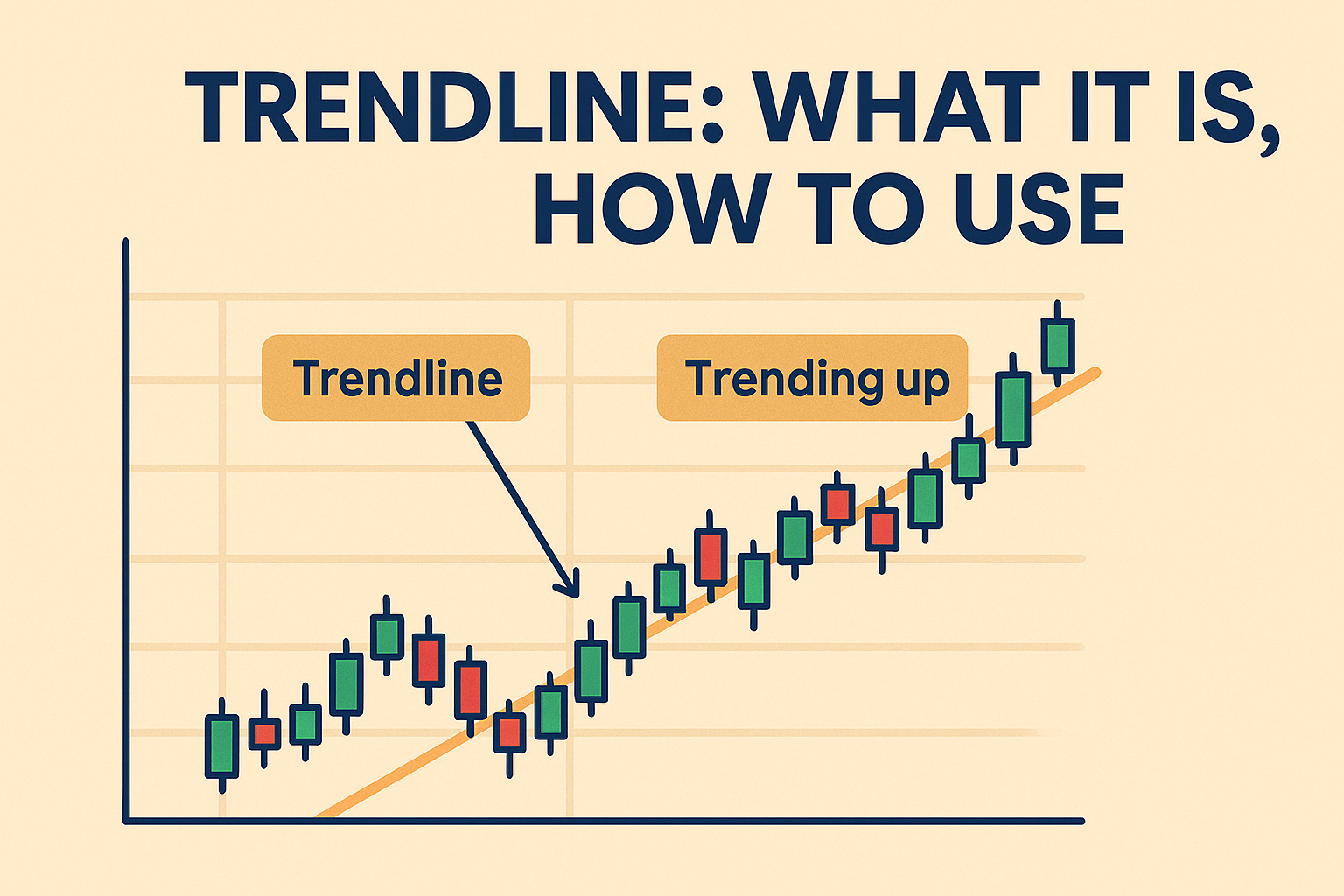
A trendline is a straight line drawn on price charts, connecting multiple price points to identify and confirm market trends, support, and resistance levels. It provides visual insights into price direction, helping traders predict market movements and timing entries and exits effectively.
“The trend is your friend” — a saying that captures why trendlines are essential in technical analysis. They help traders spot the general direction of price by visually marking support and resistance levels across any timeframe.
Drawing a trendline is straightforward. You need to connect at least two points on a price chart while analyzing one-minute, daily, or weekly data, and update as new data comes in. Trendlines adapt to market changes, work with both highs and lows, and can form channels that highlight trading opportunities.
In this guide, you’ll learn how to draw trendlines correctly, use them in real trading scenarios, and combine them with chart patterns to sharpen your market analysis skills.
- Trendlines are diagonal lines connecting multiple price points, identifying market direction and key support or resistance levels.
- There are three types: uptrend (rising prices), downtrend (falling prices), and horizontal (sideways consolidation).
- Correctly drawn trendlines must connect significant price pivot points and require multiple tests for increased reliability.
- Traders use trendlines for strategies like trendline bounce, breakout trades, and multi-timeframe analysis for improved decision-making.
- Trendlines reflect market psychology, illustrating buyer and seller behaviors and sentiment shifts.
What Is a Trendline in Technical Analysis
Trendlines are bounding lines that link price points on a chart and highlight key support and resistance levels.
These simple tools are foundational to stock trading strategies, helping traders enter and exit more confidently.
Simple Concept of Trendlines
A diagonal line connecting three or more price pivot points on a chart creates a trendline. These lines show how an asset’s price moves over time. Traders can spot support and resistance levels and confirm market trends by drawing these lines.
The price must touch a line at least three times to make it valid. Strong trendlines often show the price touching the line multiple times over extended periods. The trendline becomes stronger each time the price tests it without breaking through.
Trendlines offer a straightforward yet powerful way to judge entry and exit timing. We used them with price charts, and they can boost other technical indicators like MACD and RSI.
Types of Trendlines: Uptrend, Downtrend, and Horizontal
Uptrend Lines: These lines slope upward and form by connecting two or more low points. The second low must be higher than the first. Uptrend lines work as support levels, showing that net demand beats supply even as prices climb. The uptrend stays intact while prices hold above the trendline. A break below might signal a trend shift.
Downtrend Lines: These lines slope downward by connecting two or more high points. The second high must be lower than the first. Downtrend lines act as resistance, showing that net supply exceeds demand as prices fall. Prices staying below the line mean the downtrend continues. A break above could mean a trend reversal.
Horizontal Trendlines: Sideways markets or consolidation periods create these lines. They link similar price levels without strong up or down movement.
Trendlines are even more powerful when aligned with broader stock market strategies to enhance timing and trade selection.
The Psychology Behind Trendline Support and Resistance
Market participants’ collective behavior makes trendlines work. Buyers jump in at support trendlines because they see undervalued assets. This creates demand that drives prices up. Sellers step in at resistance trendlines when they call it overvalued. This increases supply and pushes prices down.
Rising prices and growing demand in uptrends show buyers’ determination. Falling prices with increasing supply in downtrends reveal sellers’ resolve. Trendlines give us a window into trader’s psychology and show how they react to market changes.
How to Draw Trendlines Correctly
Drawing trendlines that work needs precision and specific principles. Many traders don’t use trendlines correctly, but becoming skilled at proper technique substantially improves their reliability as trading tools.
Identifying Valid Touch Points for Your Trendline
A valid trendline needs at least two major swing points, though three points prove its reliability. Quality trendlines link major swing points instead of minor fluctuations. The trendline’s strength grows each time price tests it without breaking. Look for clean touch points where price clearly respects the level. Major highs or lows that stand out on your chart work best.
Step-by-Step Process for Drawing Uptrend Lines
Start by checking if the market shows an uptrend through higher highs and higher lows. Pick at least two low points where the second low sits higher than the first. Connect these points with an upward sloping diagonal line. The line should extend forward to show potential future support areas. Note that uptrend lines work as support levels and should touch the candles’ wicks rather than cutting through bodies.
Step-by-Step Process for Drawing Downtrend Lines
Downtrend lines need two or more significant high points where each new high falls below the previous one. A diagonal line sloping downward should connect these points. The space between your chosen points should be free of price obstructions. Downtrend lines serve as resistance levels that price should respect on future tests.
Common Drawing Mistakes to Avoid
Traders often make the mistake of plotting lines with open and close prices while ignoring the candles’ highs and lows. It also hurts your analysis to draw lines without precise anchor points. Lines that extend infinitely forward without adapting to changing market conditions lead to poor decisions. The timeframe context matters since daily trendlines carry more weight than 15-minute versions. Don’t force parallel channel lines if price action doesn’t support them.
Real Trading Examples of Trendline Analysis
Trendlines show their practical value in financial markets of all sizes. Real-life trading examples reveal how these visual tools work in ground scenarios.
Trendline Trading in Stock Markets: Apple Case Study

Apple’s stock perfectly exemplifies trendline application in equity markets. The stock showed clear trendline support during its upward trajectory from 2016 to 2023. Apple traded at a price-to-earnings ratio of approximately 10 in 2016, which later expanded to 40. This expansion aligned with consistent uptrend lines that connected higher lows throughout this period. Apple’s valuation hit $2 trillion, making it the most valuable company that ever existed. Traders who connected the rising lows on Apple’s charts found significant support levels before major price advances.
Forex Market Trendline Example: EUR/USD Daily Chart
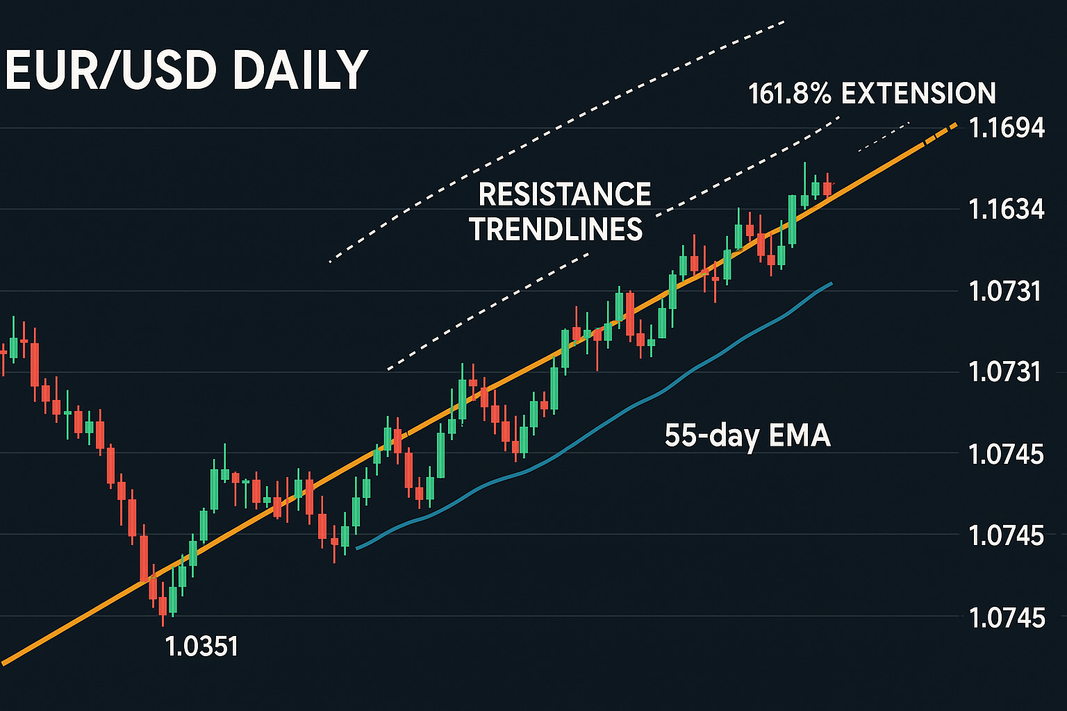
The EUR/USD currency pair shows how trendlines work in forex markets. The daily chart formed a clear uptrend line that connected lows from 1.0358 through 1.0731 and beyond. This uptrend pointed toward a 161.8% extension target at 1.1694. Each test of the trendline gave traders potential buying opportunities. Parallel resistance trendlines provided profit-taking zones. The price structure suggested bullish momentum would continue as long as prices stayed above the 55-day EMA (near 1.0745).
Cryptocurrency Trendline Analysis: Bitcoin Weekly Chart
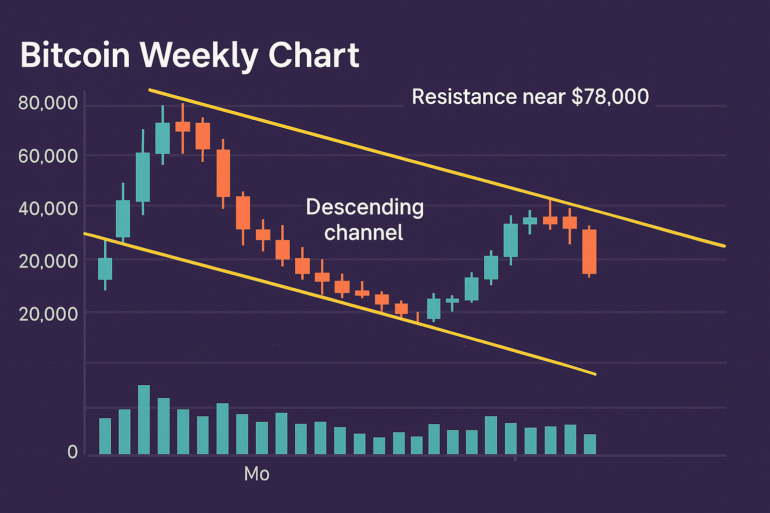
Bitcoin’s weekly chart reveals how trendlines apply to cryptocurrency markets. Recent trading shows Bitcoin 6 months old descending channel pattern, with prices following both upper and lower trendlines. This channel created clear resistance near $78,000. Bitcoin’s volatile nature makes trendline analysis vital because these lines help traders distinguish normal retracements from actual trend reversals. Traders often watch volume patterns when Bitcoin tests a significant trendline to confirm if support or resistance will hold.
These examples prove trendlines are great tools to identify potential entry points, profit targets, and stop-loss levels in assets of all types.
Trendline Trading Strategies for Profit
Trendlines become powerful profit-generating tools when traders use them strategically. Here are three tested methods that turn trendline analysis into reliable trading strategies.
The Trendline Bounce Strategy
Price reactions from trendlines create opportunities for the trendline bounce strategy. Strong trends work best with this approach as prices test a trendline before moving in the main direction. The strategy works most reliably on charts showing 30-minute timeframes or longer to minimize false signals.
The strategy requires these steps:
- Higher timeframe analysis confirms a strong trend
- Price touches and rebounds from the trendline
- Buy stop orders go 5-10 pips above the rebound candle’s high (in uptrends)
- Stop-loss sits 5-10 pips below the latest swing low
- Recent swing high serves as the profit target
Bearish markets need the opposite approach – short positions after price bounces from downtrend lines. The strategy doesn’t work in sideways markets, so a clear trend must exist first.
Trendline Breakout Trading Technique
Breakouts beyond trendlines signal possible trend changes or accelerations. A breakout becomes valid when price closes decisively beyond an old trendline with increased volume. The “trendline flip” happens when previous support turns into resistance or the other way around.
Successful breakout trades need confirmation before entry. Traders should wait for the trading period to close or look for higher-than-normal volume. Stop-loss orders work best when placed within old support/resistance zones, protecting positions while allowing normal retests.
Using Multiple Timeframe Trendlines for Confirmation
Multiple timeframe analysis makes trendline trading more reliable by showing the bigger picture. This method starts with higher timeframes to understand direction, then moves to lower timeframes for exact entries.
Daily charts reveal major trends, while hourly or 15-minute charts show precise entry points. Trade success rates increase when trendlines match across different timeframes. This approach leads to better reward-to-risk ratios, shorter holding times, and clearer exit signals.
Conclusion
Trendlines are vital tools that help traders find reliable ways to analyze markets. This piece shows how these dynamic indicators identify market direction, support-resistance levels, and uncover trading opportunities in financial markets of all types.
The psychology behind trendlines helps you identify genuine market sentiment changes instead of short-term price movements. You can now apply trendlines confidently to your trading decisions with proper drawing techniques and knowledge of common mistakes.
Examples from stocks, forex, and cryptocurrency markets showed how valuable trendlines are in practice. These versatile tools adapt well to different trading styles and market conditions, whether you use bounce strategies, breakout techniques, or multiple timeframe analysis.
Successful trendline trading needs patience, practice, and precise execution. Begin with basic applications on daily charts and then move to advanced strategies. Your experience will make trendlines natural parts of your technical analysis toolkit that lead to smarter trading decisions.
Frequently Asked Questions
1. How do I effectively use trendlines in trading?
To use trendlines effectively, connect the highs during a downtrend and the lows during an uptrend. This approach allows you to identify potential entry points for trend-following trades and signals for potential trend reversals when the trendline breaks.
2. What are the different types of trendlines?
There are three main types of trendlines: uptrend lines (positive slope), downtrend lines (negative slope), and horizontal trendlines. Uptrend lines act as support levels, downtrend lines as resistance, and horizontal trendlines represent sideways markets or consolidation periods.
3. How can I avoid common mistakes when drawing trendlines?
To avoid common mistakes, ensure you use significant swing points rather than minor fluctuations, consider both wicks and bodies of candles, and avoid arbitrarily drawing lines without precise anchor points. Also, remember that trendlines on higher timeframes carry more weight than those on lower timeframes.
4. What is the trendline bounce strategy?
The trendline bounce strategy involves entering trades when price rebounds from an established trendline. It works best in strong trends on timeframes of 30 minutes or higher. Traders typically enter with a buy stop order above the rebound candle’s high for uptrends, with a stop-loss below the recent swing low.
5. How can multiple timeframe analysis enhance trendline trading?
Multiple timeframe analysis improves trendline trading by providing broader context. Start by identifying major trends on higher timeframes (e.g., daily charts) and then use lower timeframes (e.g., hourly or 15-minute charts) for precise entry points. When trendlines align across multiple timeframes, it increases the probability of successful trades.